“How quickly the world owes us something we knew existed only 10 seconds ago.”
That’s how Louis CK describes our generation’s attitude towards technology. A few neurotic seconds and we’re off looking for another website to answer our question, or provide us with the products we want.
Online companies today need not only provide their customers with good, quality solutions, products and services- but also, if not first and foremost, ensure their visitors stay on the website for more than a few miserable seconds… And how do we do that? Well, hopefully by now you all know the answer to that question- user engagement.
Without getting into the many factors creating a successful user engagement, let’s focus on one key factor stemming from recently emerging digital device technology (tablets, mobile devices, different wearables and soon-to-be-invented devices): responsiveness.
What’s responsiveness got to do with user engagement? Well, everything
Today, browsing the internet with mobile devices has become a primary way for people to experience the web, and with an average of about 15 seconds before your visitors click away from your website on their personal computers, imagine how long before they leave it when standing in the supermarket or just as they leave the train.
It’s a fact- with the mobile market exploding with unprecedented growth, marketers are now increasingly embracing the important implications of a responsive web design (RWD) as a must-have factor for enhancing UX on mobile devices.
And so online companies today are facing the challenge of making their websites as accessible and easy to navigate as possible, on any device. And a responsive web design allows you to do just that, by giving your page a universal element.
With equal access of information based on a single code-base regardless of the device, you’re giving your website these advantages:
- Faster development compared to developing 3 or 4 distinct sites
- Easier maintenance as only one set of code and content needs to be updated rather than 3 or 4
- Future proofing in that it can support new and yet-to-be-invented devices
Want to talk to us about customizing your online products? click here.
Same goes for online product customization
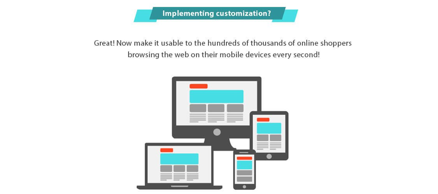
Online shopping on mobile devices is a fast-growing market, and the sooner you get in there the better. The key is obvious- you have to have a responsive website. Implementing customization? Great! Now make it usable to the hundreds of thousands of online shoppers browsing the web on their mobile devices every second!
So what’s the problem? Take your website, squeeze it onto the mobile screen and that’s that right?
Wrong. Responsive web design means more than a simple add-on to your website, it means re-building your existing website around a device-agnostic experience, based on knowledge about your (mobile) users and their needs. It means constant usability testing on designs across platforms, while focusing on at least 3 crucial aspects: content prioritization, design and performance.
Because just like with personal computers, a negative mobile-viewers experience can easily turn away potential customers and even loyal visitors. Not to mention it will reflect poorly on the quality of your site.
Conclusion? When customizing your online products, make sure you choose a vendor that optimizes your UX across all devices, making your online store a fun, engaging, easy-to-use place to visit.
Want to talk to us about customizing your online products? click here.
References
Schade, A. (2014, May 4). Responsive Web Design (RWD) and User Experience. Nielsen Norman Group. Retrieved from http://www.nngroup.com/articles/responsive-web-design-definition/
36Creative.com. (2013, 03 18). WHY IS RESPONSIVE UX DESIGN SO IMPORTANT? 36Creative.com. Retrieved from https://36creative.com/design-thoughts/1499/responsive-ux-web-design
CK, L. (n.d.). Louis CK – about airplane Wi-Fi. (L. n. Show, Interviewer) Retrieved December 2015, from https://www.youtube.com/watch?v=ZFsOUbZ0Lr0
Switzer, N. (2013, May 14). Create a Better Responsive User Experience. UX MAGAZINE. Retrieved from https://uxmag.com/articles/create-a-better-responsive-user-experience


